The Tone of Light: Choosing Color Temperatures with Intention
Light does more than illuminate. It shapes mood, draws focus, and determines how a room feels when lived in. Among its quiet powers, color temperature is one of the most defining. From golden warmth to crisp daylight clarity, choosing tone with care transforms lighting from utility to atmosphere.
Understanding Color Temperature
Measured in Kelvin (K), color temperature describes whether light leans warm, neutral, or cool. Each tone holds a different character:
-
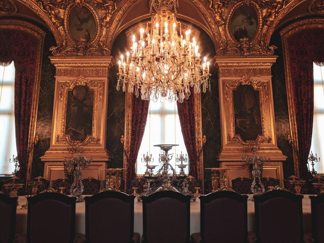
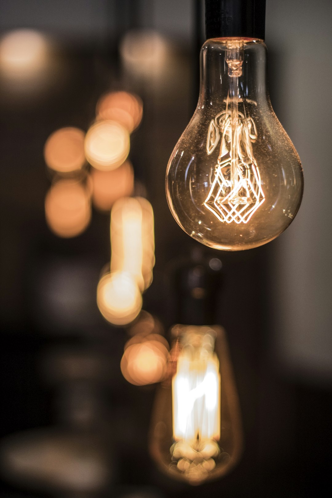
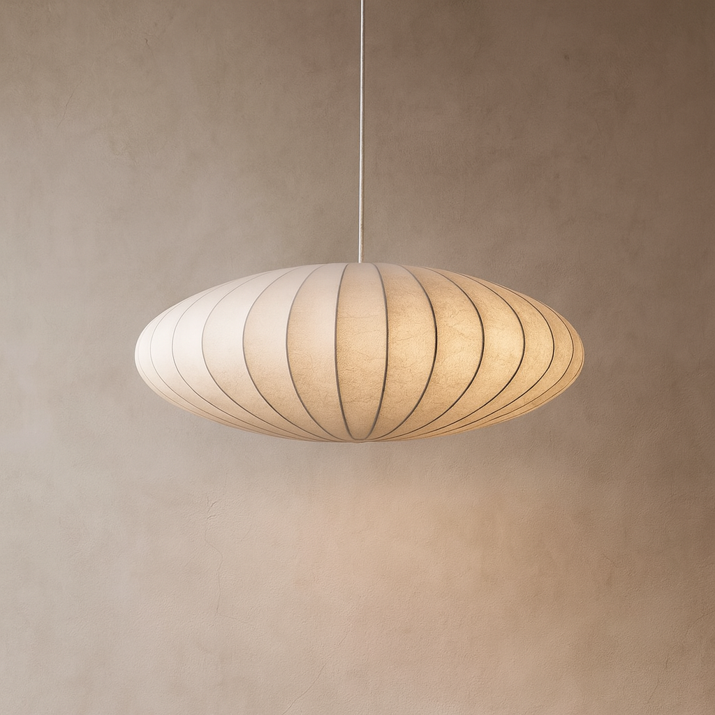
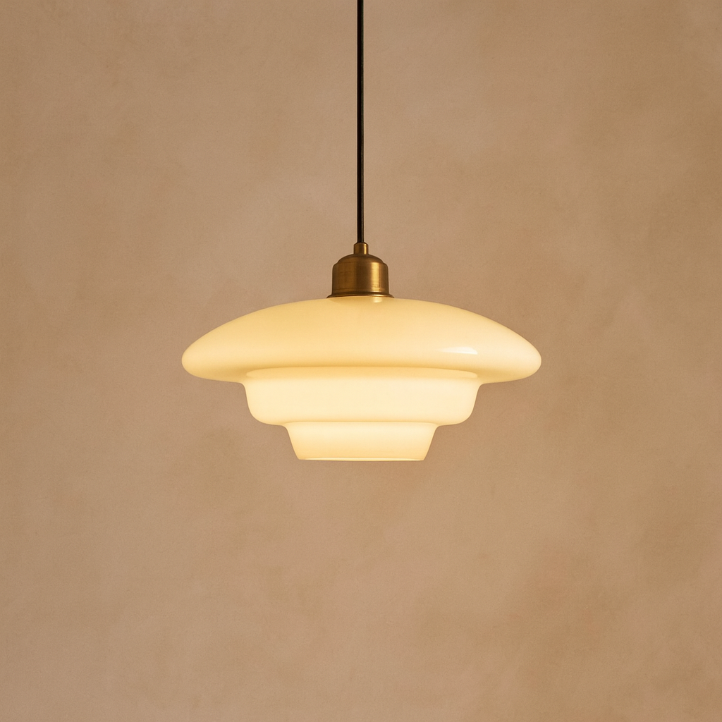
Warm White (2700K–3000K) — soft, golden, and inviting; suited to evenings and places of rest.
-
Neutral White (3500K–4100K) — balanced and natural; a gentle clarity for task-led spaces.
-
Cool White / Daylight (5000K–6500K) — crisp, energizing, echoing natural morning light; ideal for focus and precision.
To read color temperature is to read mood. The right choice is less about numbers, more about how you want to feel in a space.
Mood and Function
Each tone carries its own rhythm:
-
Warm Light (2700K–3000K) — relaxed, intimate, ideal for living rooms, bedrooms, and dining.
-
Neutral Light (3500K–4100K) — clear without harshness, supporting kitchens and bathrooms.
-
Cool Light (5000K–6500K) — alert and focused, echoing daylight in offices and workspaces.
Walls, textures, and finishes all shift subtly under these tones, altering how a room breathes.
Choosing Tone by Room
Consider light as part of the room’s purpose:
-
Living & Bedroom: 2700K–3000K, warm and calm.
-
Kitchen & Bathroom: 3500K–4100K, bright yet comfortable.
-
Home Office & Task Areas: 5000K–6500K, clear and energizing.
This is less a rule than a quiet framework—anchoring your choices in both function and feeling.
Mixing with Intention
Consistency is grounding, but sometimes balance calls for contrast.
-
Layering: A kitchen may hold warm ambient light with cooler task lighting.
-
Zoning: Open spaces can be gently divided through shifts in tone.
-
Highlighting: Warmer light softens textures, while cooler light sharpens minimal edges.
The key is not random variety but intentional layering—tone chosen to suit both purpose and atmosphere.
What to Avoid
Even thoughtful interiors can falter with poor lighting. Common missteps include:
-
Overusing cool tones in restful spaces, creating sterility.
-
Mixing warm and cool light without balance, unsettling the eye.
-
Ignoring how surfaces reflect light, shifting tones in unintended ways.
Mistakes are rarely about numbers—more often about not listening to how light interacts with its surroundings.
Bringing It Together
Color temperature is not only technical. It is emotional—deciding whether a room comforts, energizes, or distracts. By choosing tone with intention, layering with purpose, and aligning light to life’s rhythms, you create more than illumination. You create harmony.